This is one of the most important channels to grow your home service business, improve your online presence and turn more of your website browsers into customers. So, we decided to ask this question to 5 of the leading experts in Home Service website creation and website design (seriously, these folks are some of the sharpest and know their stuff.)
The question is simple: What can a home service business do to improve its website and turn more web browsers into paying customers? Here’s what 5 of the leading experts advise.
Tip #1 – Eric Bussey: Your phone number should be “upper right, big and bright”

According to Eric Bussey, a seven-year veteran of the pest control industry, who went on to form his own marketing agency for pest control companies, Pest Customers Now, the most important thing that you can do to improve your home service website ensures that your phone number is in the upper right-hand corner, or “upper right, big and bright.” This way, your phone number is easily visible and one of the first things people see since people read from left to right and top to bottom.
Additionally, Eric advises ensuring that your website loads as fast as possible. Otherwise, “after two or three seconds of waiting, potential customers will click off of your website and onto a competitor’s.”
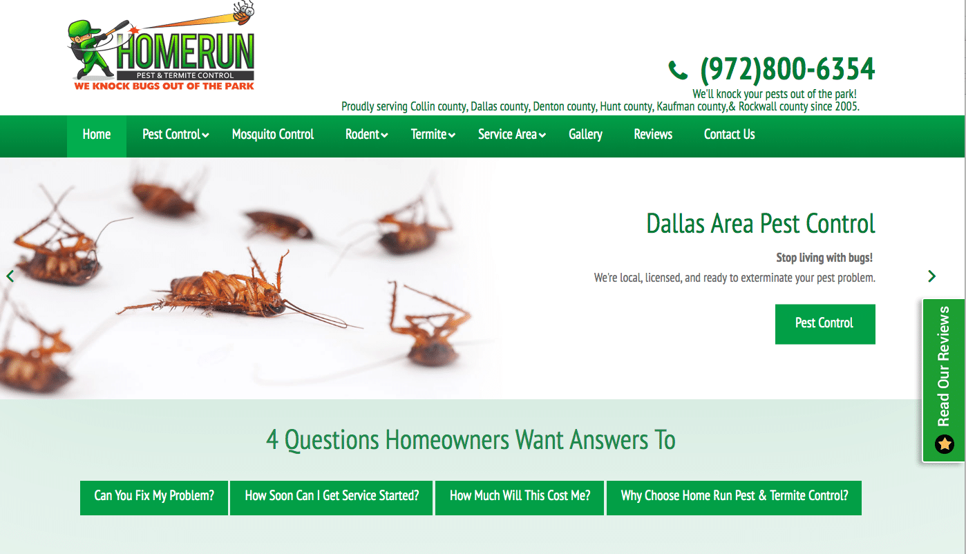
One of Eric’s favorite examples of awesome websites for pest control companies is Home Run Pest. According to Eric, “it clearly provides value. They even put the FAQ above the fold that will answer questions that a potential customer will have when doing research. They also have a review widget on their site where customers can easily view real customer testimonials.”
[elementor-template id=”8572″]
Tip #2 – Randy Mitchelson: Always think mobile responsive

When it comes to creating the best home improvement websites, Randy Mitchelson, VP of Sales and Marketing at iPartnerMedia, an award-winning Google Partner and website design company for home services companies, says the key is thinking mobile. According to Randy, “All too often, we see home service websites that are not mobile responsive, lack security certificates, and perform slowly, especially on smartphones.”
What’s important to realize is that your desktop and mobile browsers often have very different needs, with desktop browsers often in research mode while mobile browsers often want to solve an immediate need. Because of this, Randy says that your mobile website doesn’t have to mirror your desktop site, and it can look completely different.
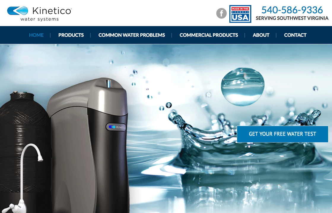
One of Randy’s favorite home service websites is Kinetico water systems, which he finds effective because of its high-resolution imagery, prominent click-to-call phone numbers, large buttons to request service, quick load time, and security certificates to give customers peace of mind that their info is encrypted.
Tip #3 – Cam Vacek: You get one first impression. Make it memorable

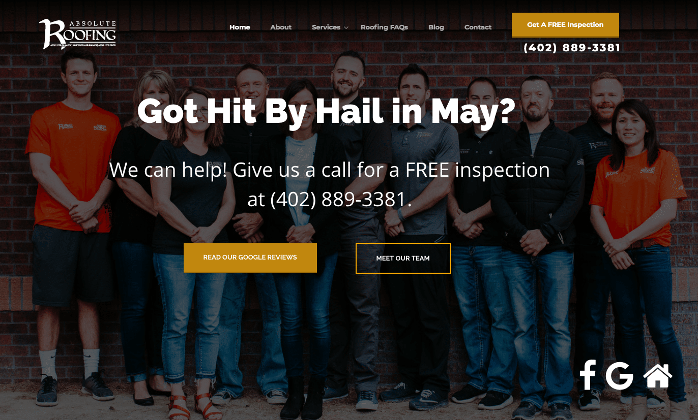
When a new user lands on your website, you only get ONE chance to make a first impression. That’s why Cam Vacek, Marketing Manager and Web Designer at Absolute Roofing, recommends “ditching the quality service, etc.,” and making the first image and headline catchy.
“Everyone uses the quality service line, and it’s boring. Especially when you’re in an overly saturated industry, as most home services are – you need to find your differentiators and communicate them well.” This is why personality goes far in-home service. It introduces who you are, shows transparency, and helps site browsers form a connection with your company. Cam also recommends including photos of your staff on your site because people like to know who is entering their homes.
When it comes time to recommend a favorite home service site, Absolute Roofing is a great example of personality in the roofing industry. The hero shot is a big, high-res shot of the entire team, and the content is refreshingly unique. No boring, repetitive mention of “quality service” anywhere to be found on the site. It instead asks users right off the bat if they were hit by hail. If they were, they’re invited to call in, as they may qualify for a new roof. The question is focused, and the offer is intriguing and demands action. We consider this site a win!
Tip #4 – Catherine Wilson: Make sure project photos are organized and easy-to-navigate

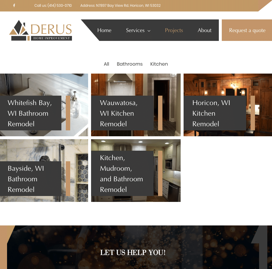
Fun fact: Your project photos are one of the most visited pages on your website. That’s why Catherine Wilson, owner of Home Pro Digital, a full-service website creation and marketing agency for home service professionals, says it’s crucial to make sure it’s well-organized and easy to navigate for prospective customers.
“A large photo gallery is hard to navigate and overwhelming for website visitors. Project galleries should be dynamic so that they are organized and filterable by types of job (e.g., kitchens, baths, additions for a remodeler, or types of flooring for a carpet cleaning company,) which we include in our website creation projects for service pros.”
When it comes time to select one of the best home improvement websites, Catherine loves the Derus Home Improvement site, which offers a simple website navigation experience and click-to-call numbers at the top of every page to catch as many interested prospects as possible. It also features a dynamic project gallery, which automatically pulls project images to the homepage, so all images on the site are fresh and up-to-date.
[elementor-template id=”8572″]
Tip #5 – Taylor Zirwas: Make sure your site is “sales-ready,” not an online brochure

When it comes to the best home improvement websites, Taylor Zirwas, Client Success Manager at Mr. Pipeline, an award-winning Internet Marketing agency for small businesses with a deep specialty in-home service, says that the key is making sure your website is “sales-ready.”
According to Taylor, “it’s important that you differentiate between an informational website (online brochure) and a sales-ready website. An informational website is great for brand exposure and for educating potential customers, but it will not yield the same results in lead generation as a sales-ready website. To help your website be more sales-ready, make sure you have the following: business logo, call to action, big phone number, contact form or online booking form (above the fold if possible), having visual elements (such as photos and short video to better give an example of the services you provide and what your company is all about) and finally relevant content with appropriate headings.”
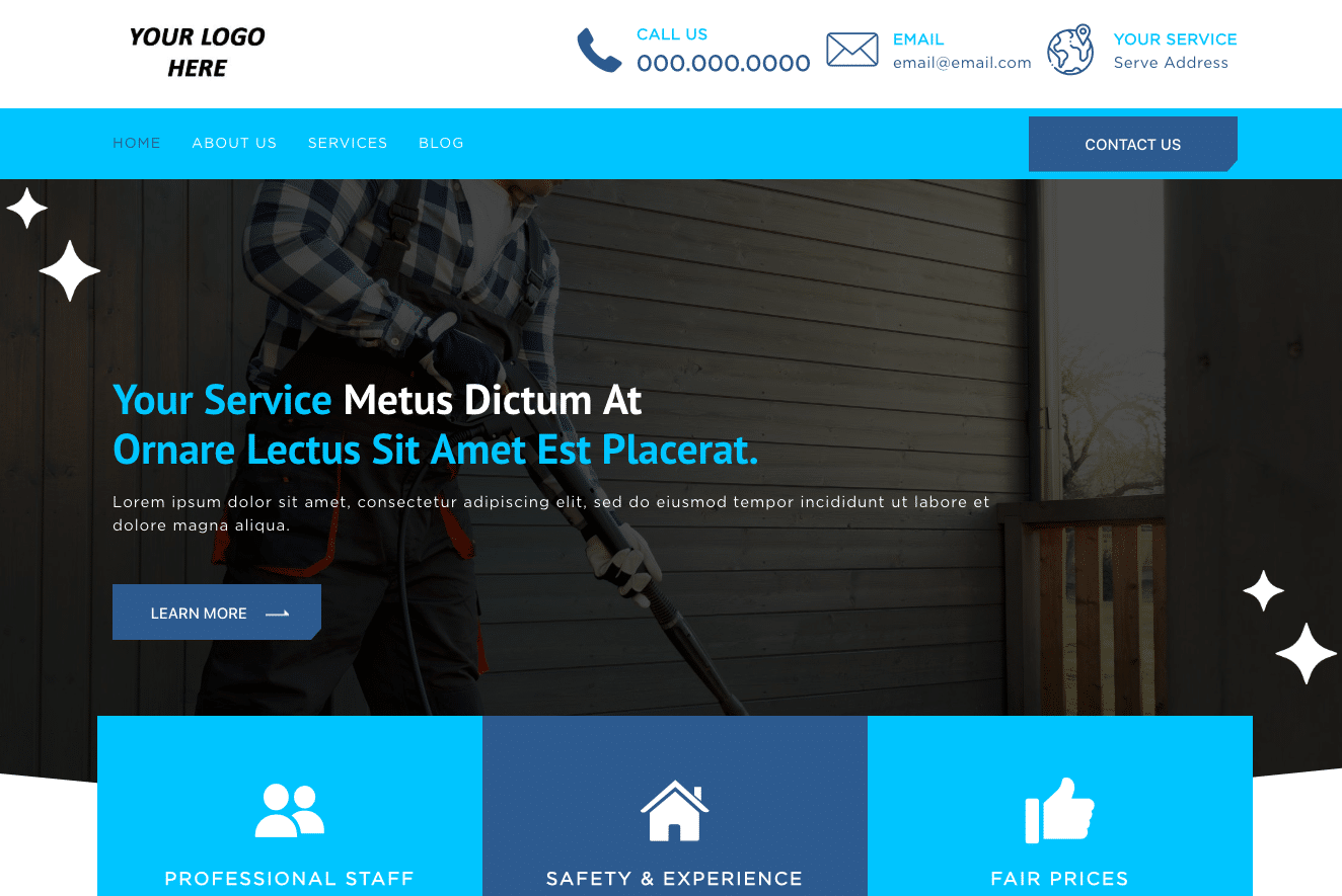
When it comes time to recommend the best home service websites, Taylor thinks that this is one of the best cleaning websites (template) that truly represents a “sales-ready” website. But, that being said, it’s also important to note that no two home service businesses are the same. “What works for one small business owner in one section of the country may not work for the same type of business owner in a different part of the country. Your business is unique, and your marketing campaign should be as well!”
